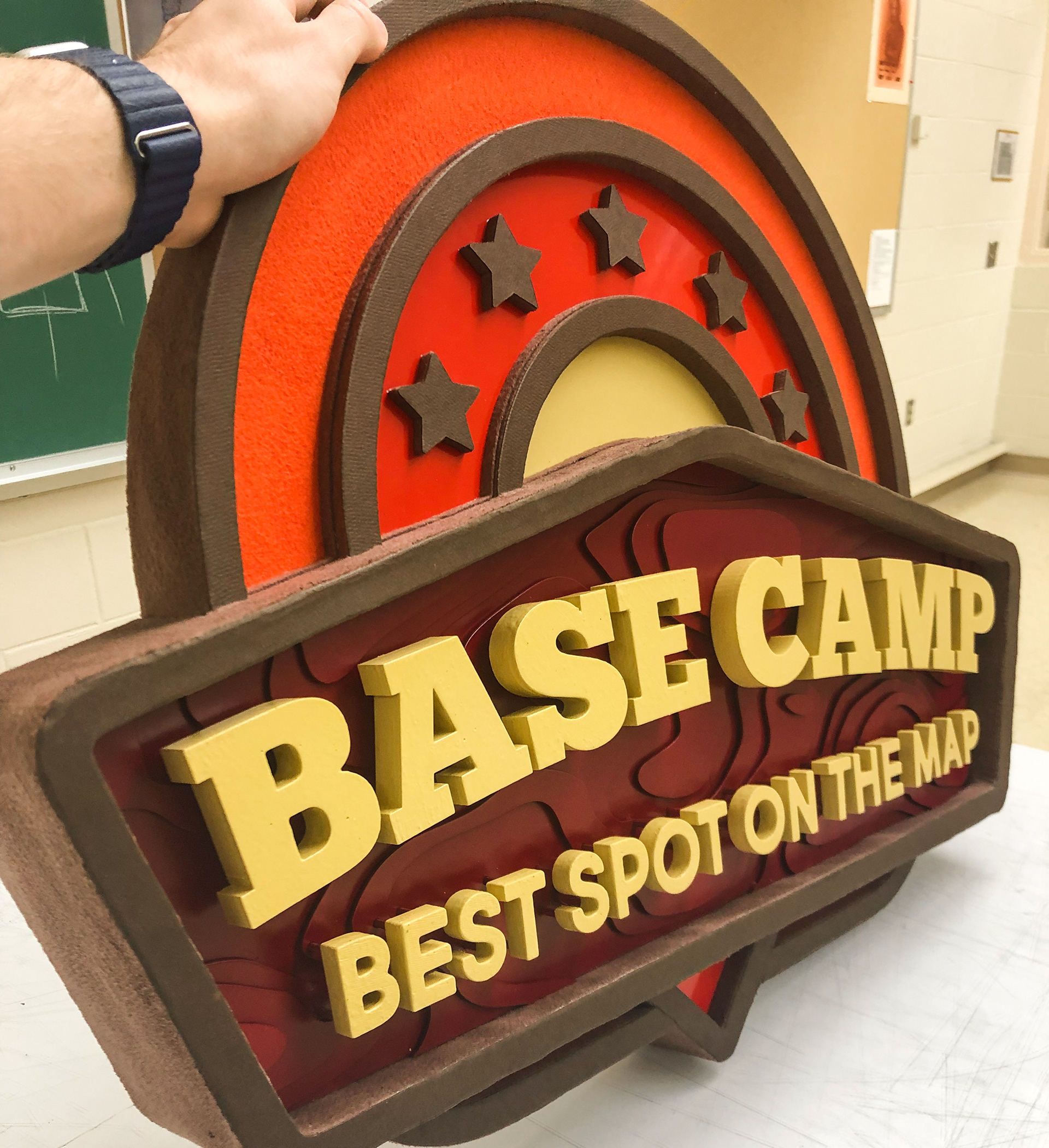
This sign was part of a much larger campaign which involved everything from event poster design to stage design. I designed the logo for this fictional event and established a brand guideline that I was able to apply to every part of the campaign.
Description
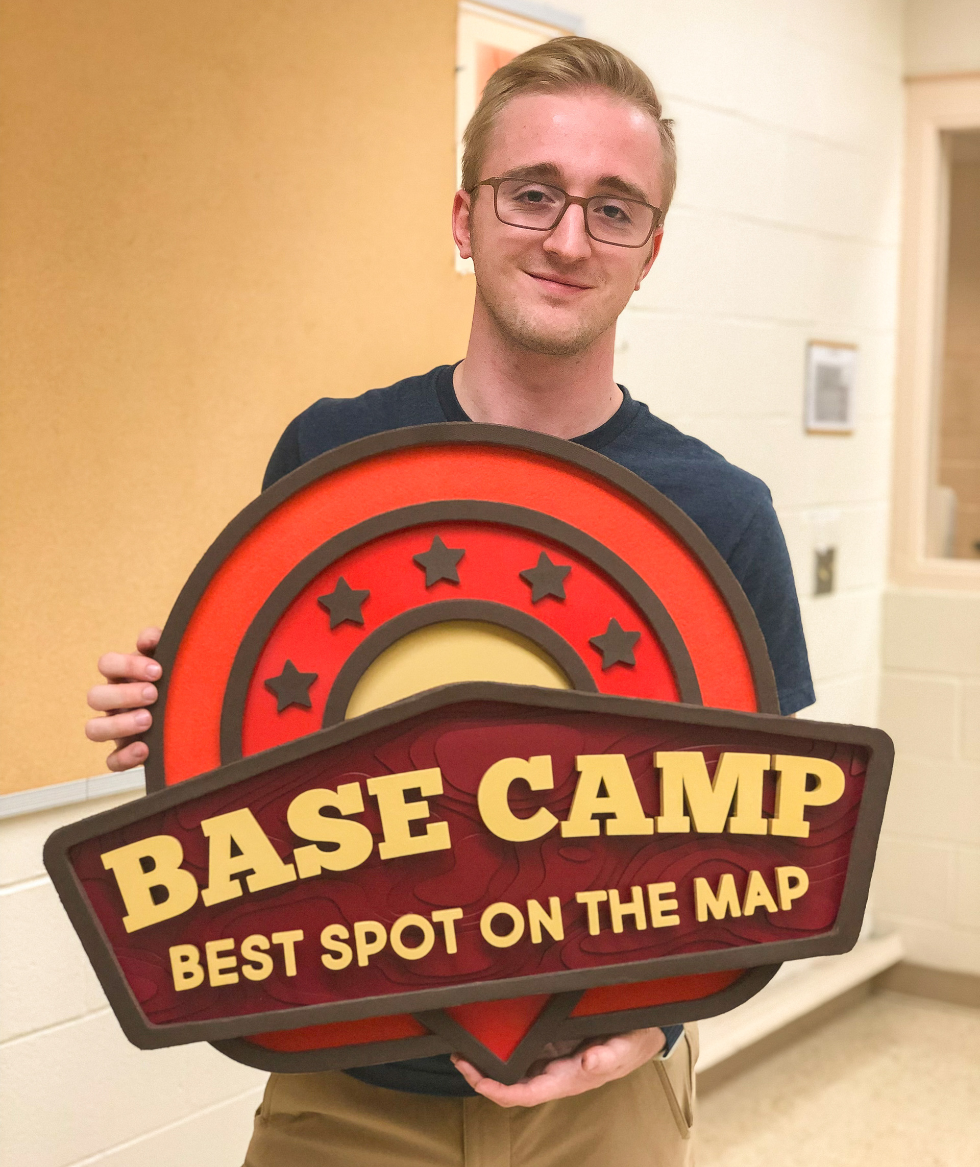
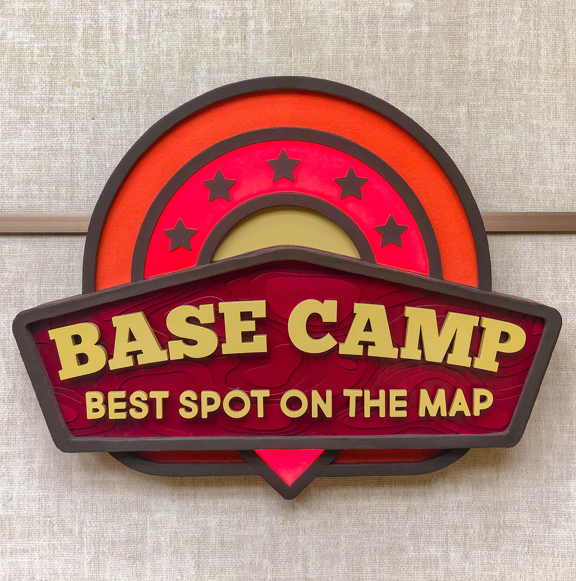
This signage piece reinforces the campaign I developed for the Base Camp convention. I took the logo I designed and used my experience with materials and equipment to fabricate a sturdy and eye-catching display.
Design Concept
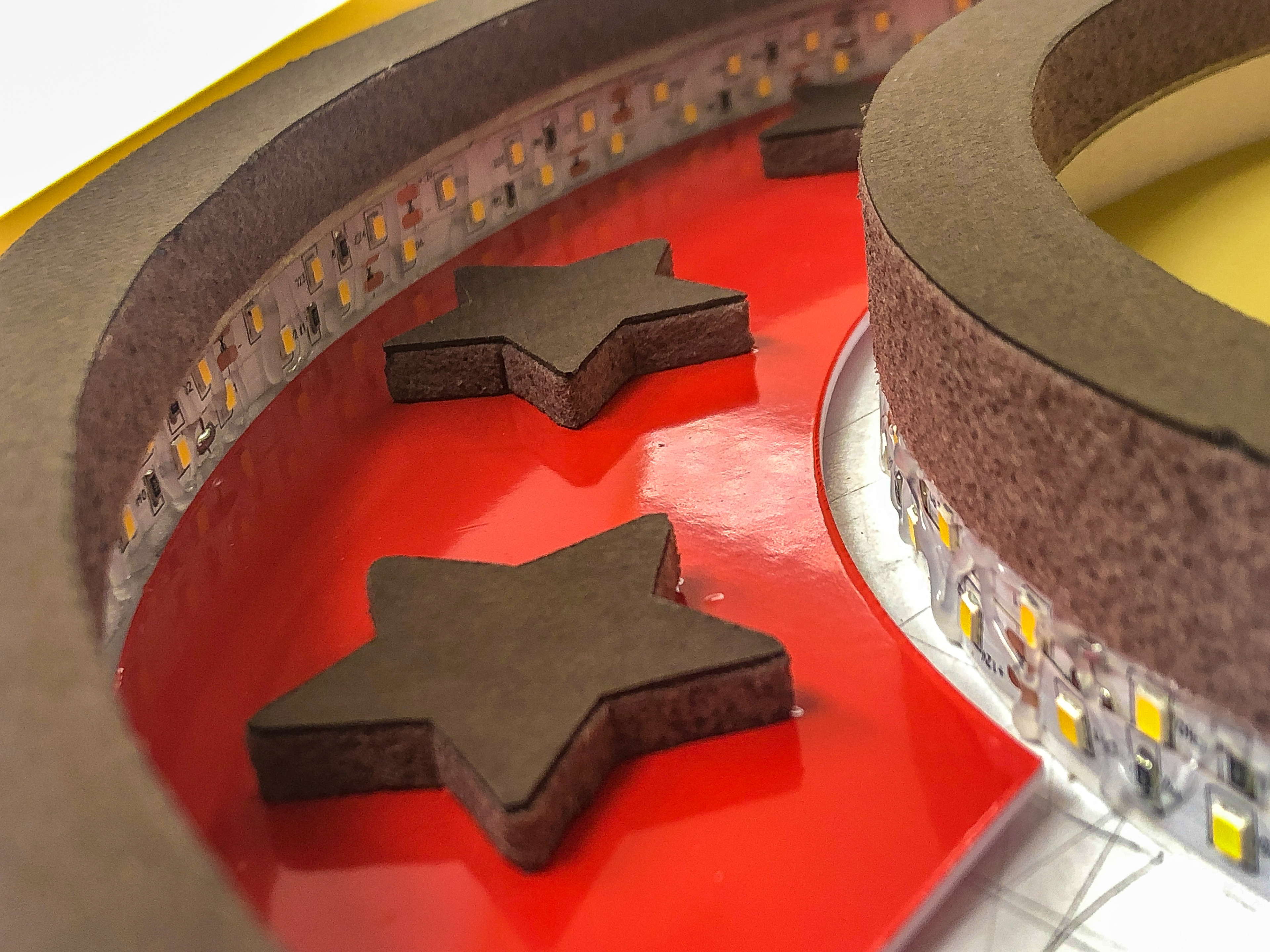
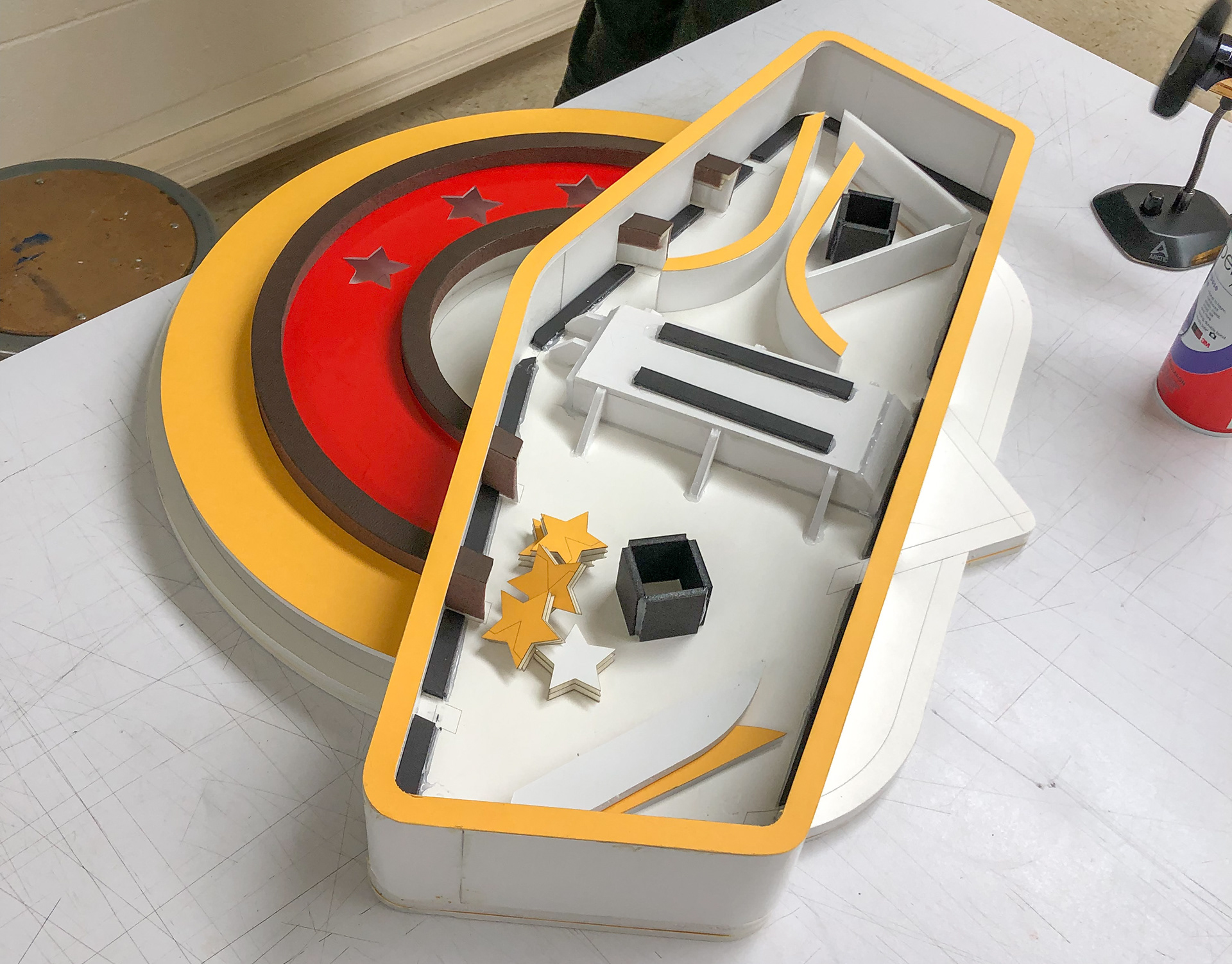
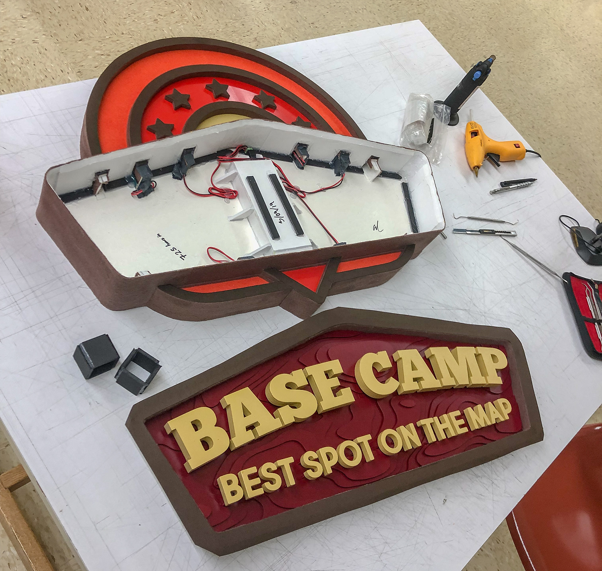
Developing the logo for this event required a lot of thinking and revising. I came up with the name first and then decided on a sturdy slab serif font for the name and a nice rounded sans serif for the catchphrase. The key idea in this logo revolves around maps. That idea was reinforced by the use of a topographical map, and the use of a red location marker behind the faceplate which is illuminated. the stars indicate a five out of five star rating system that most people would be familiar with. the orange shape is used to help give the logo some more weight and make it easier for the design to be made into a woven patch which would be popular as such an event.
Fabrication Technique
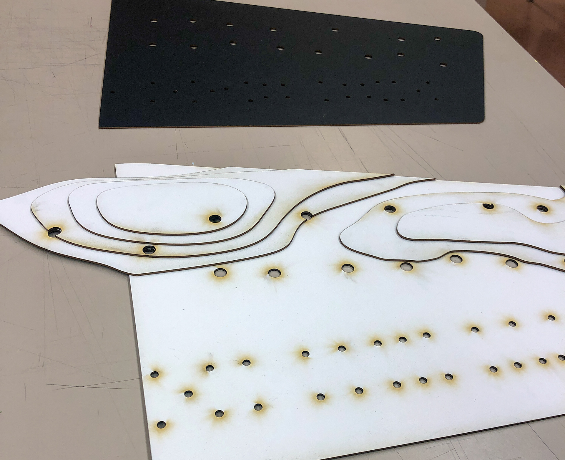
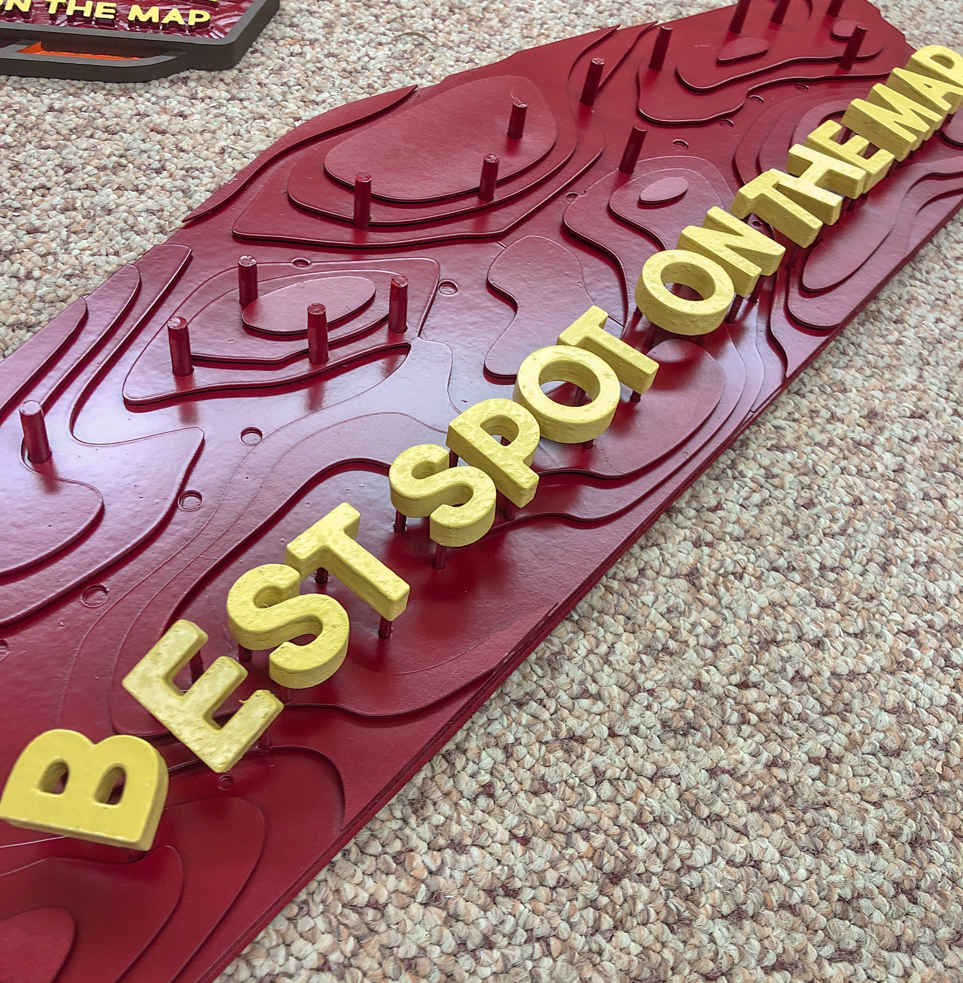
The most difficult part of this sign was the faceplate and required learning how to marry the technologies of both 3D printing for the typography and laser cutting for the topographical map in the background. Hidden behind the faceplate is a battery compartment which is used to power the LEDs that illuminate the location marker to make it stand out more prominently. Texture was introduced into the display by the use of felt which gives the sign a more organic feel for the orange and the brown sides.