Description
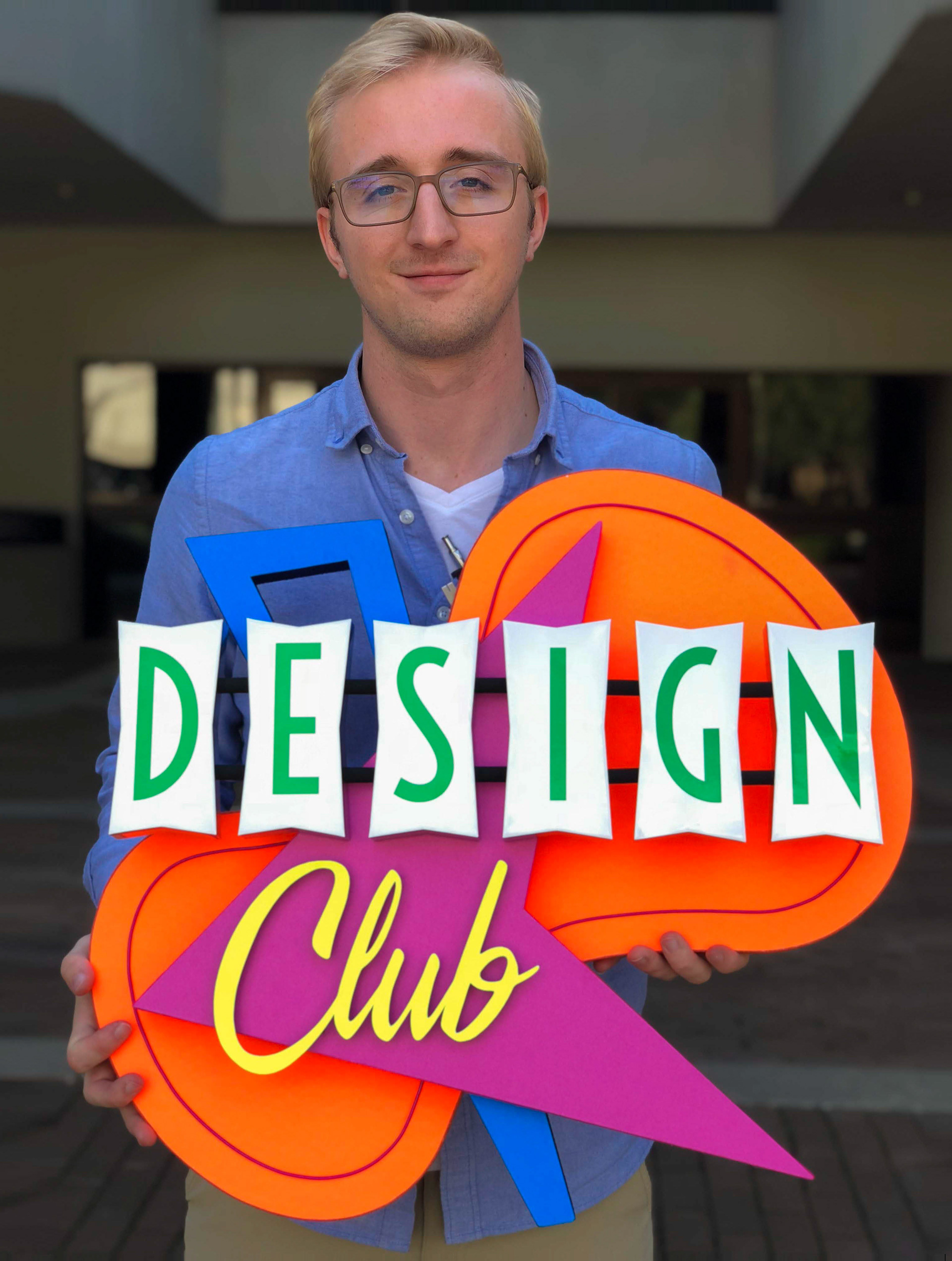
With the intention of pushing myself beyond the typical form factor of my other work, I created this sign with a much more complicated footprint. Its more complex base design allows for increased viewer engagement.
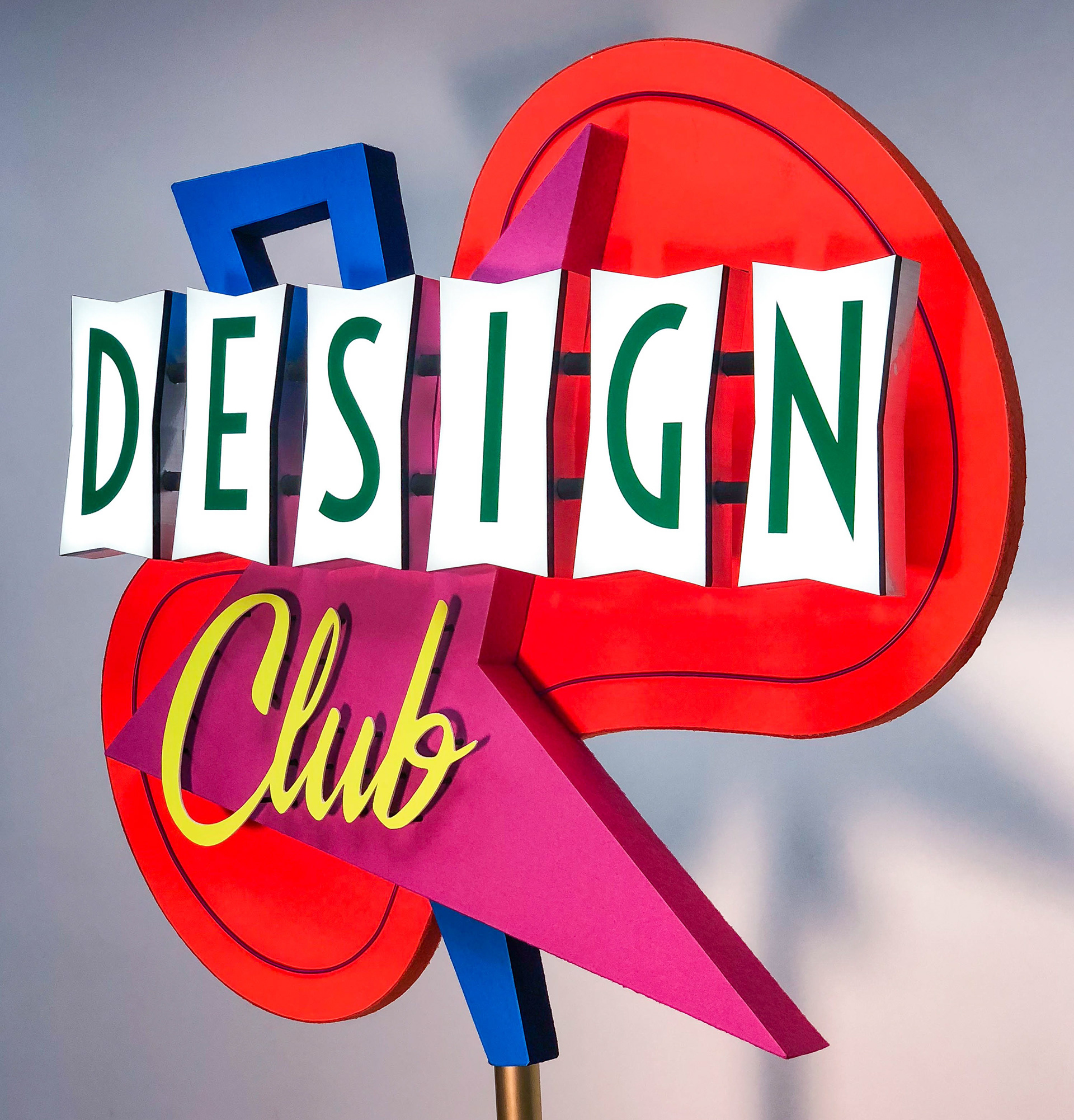
Design Concept
The basic geometry of the sign is based off of Mid-Century Modern or 50’s era signage, some of which can be seen in Las Vegas. The color palette on the other hand is a bit more relatable to the 80’s. A tall sans-serif font for the illuminated word “design” allows for maximum legibility while a classic sign painter script font returns the design to a 50’s motif.
Fabrication Technique
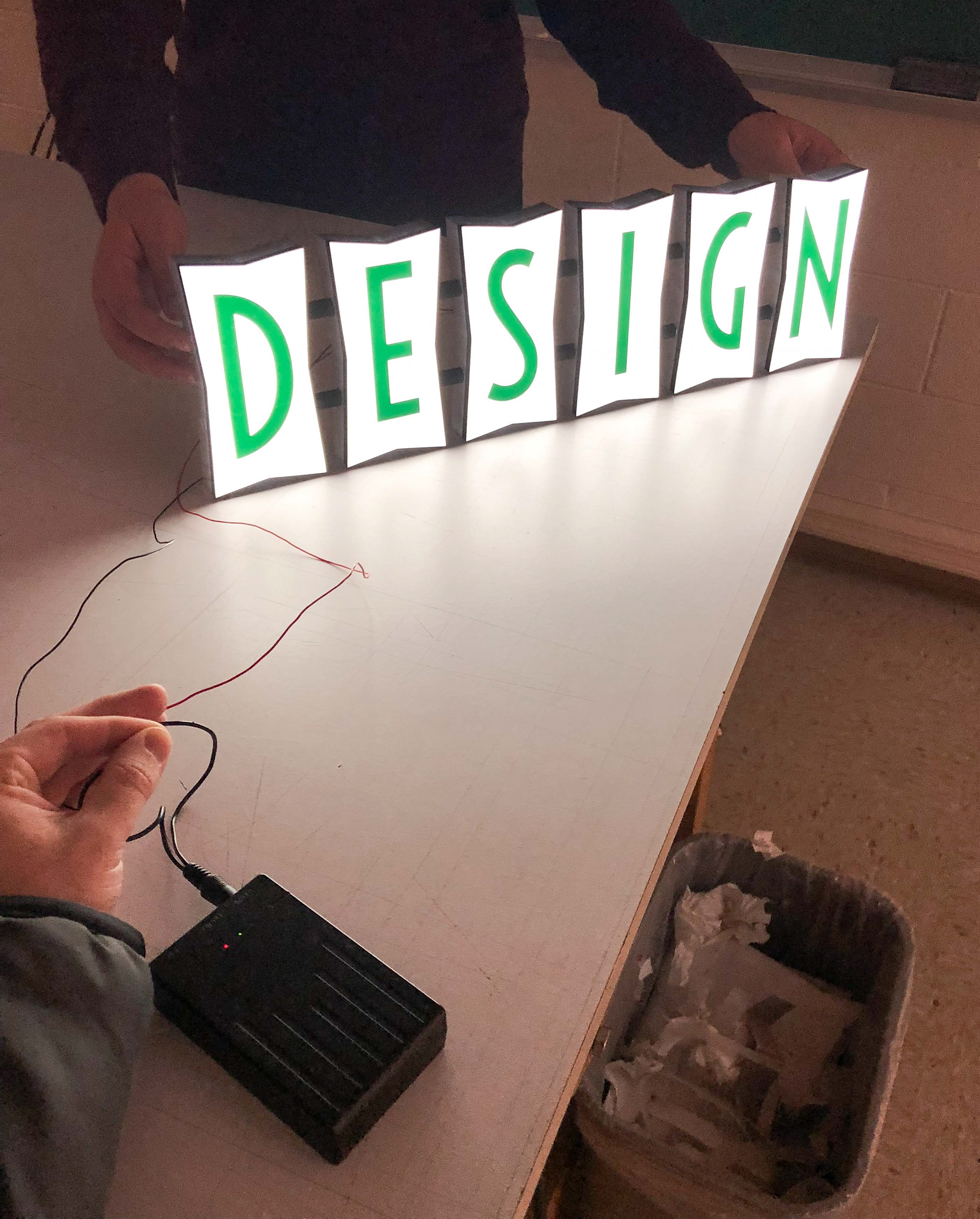
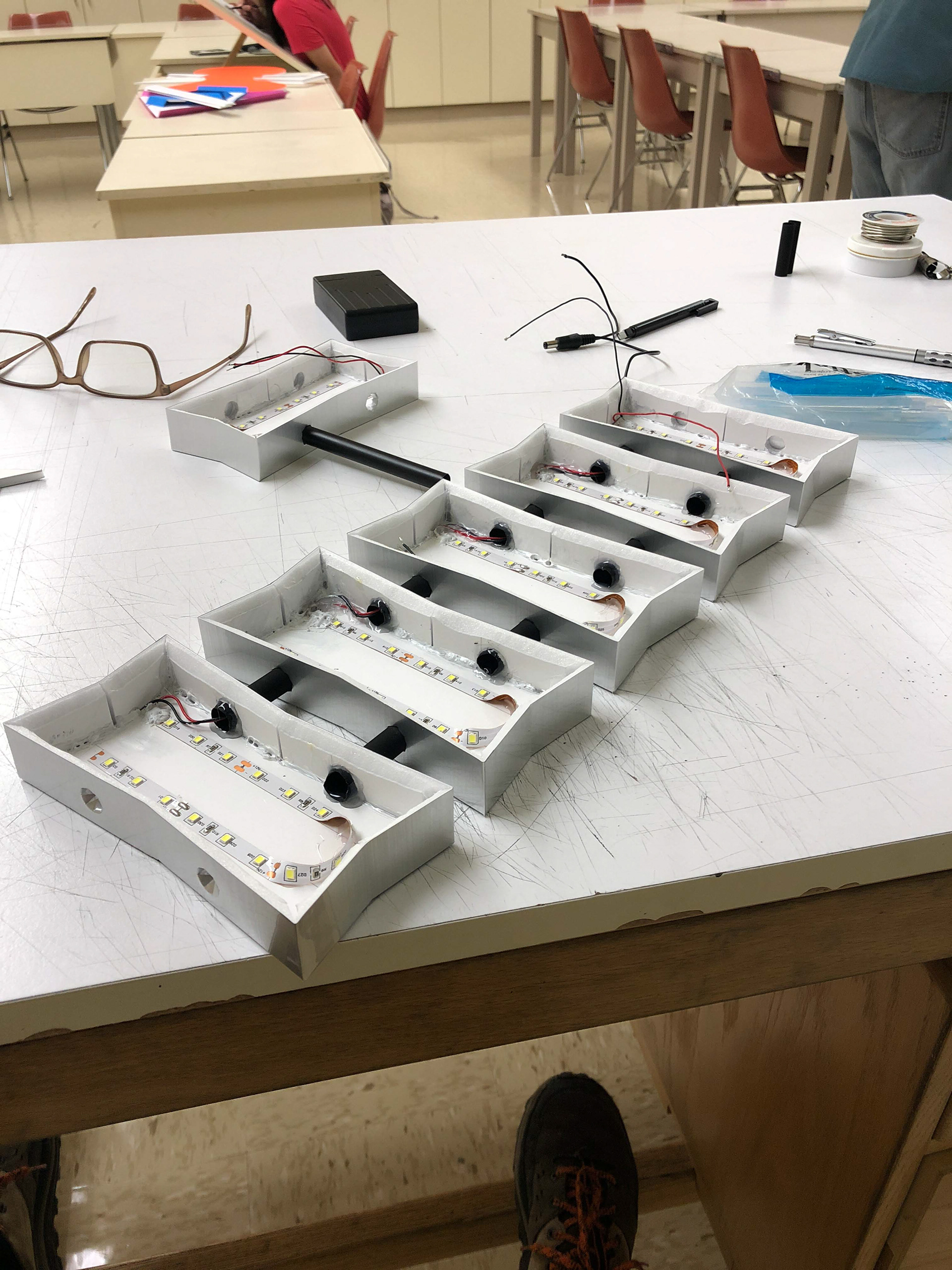
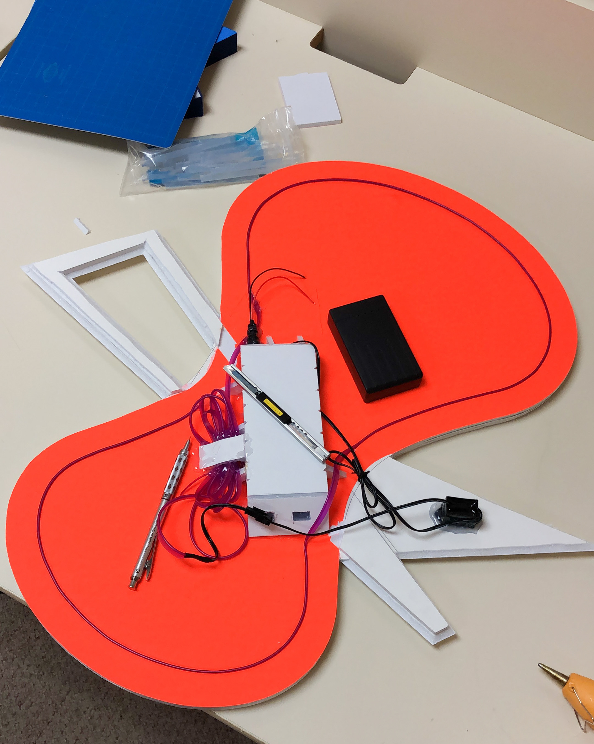
The depth of the base pieces was exaggerated by using a darker felt for the sides. The most complicated piece was the illuminated cabinets for the word “design.” Each box was individually crafted with LED’s on the inside. When switched on from a hidden battery compartment. they cast light through the white vinyl surface. The word “club” has its own drop shadow which was achieved by placing rods behind its surface that elevated it off of the triangular base.