
Description
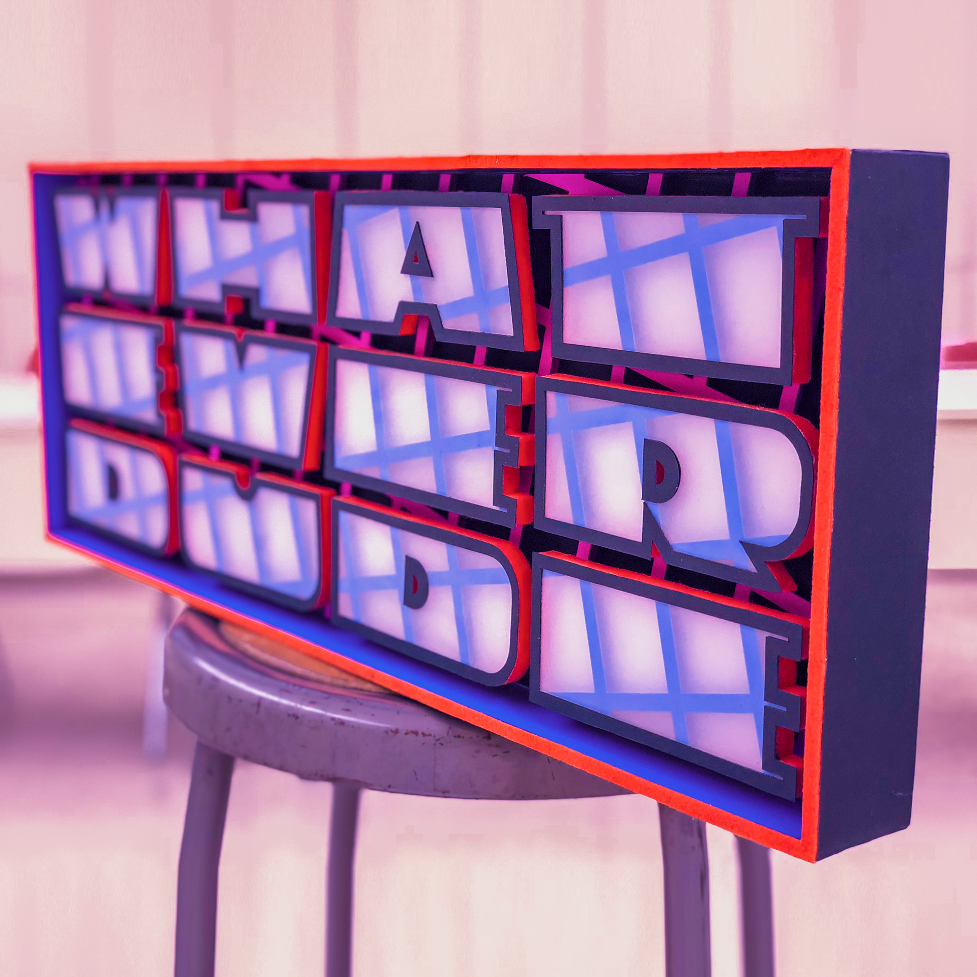
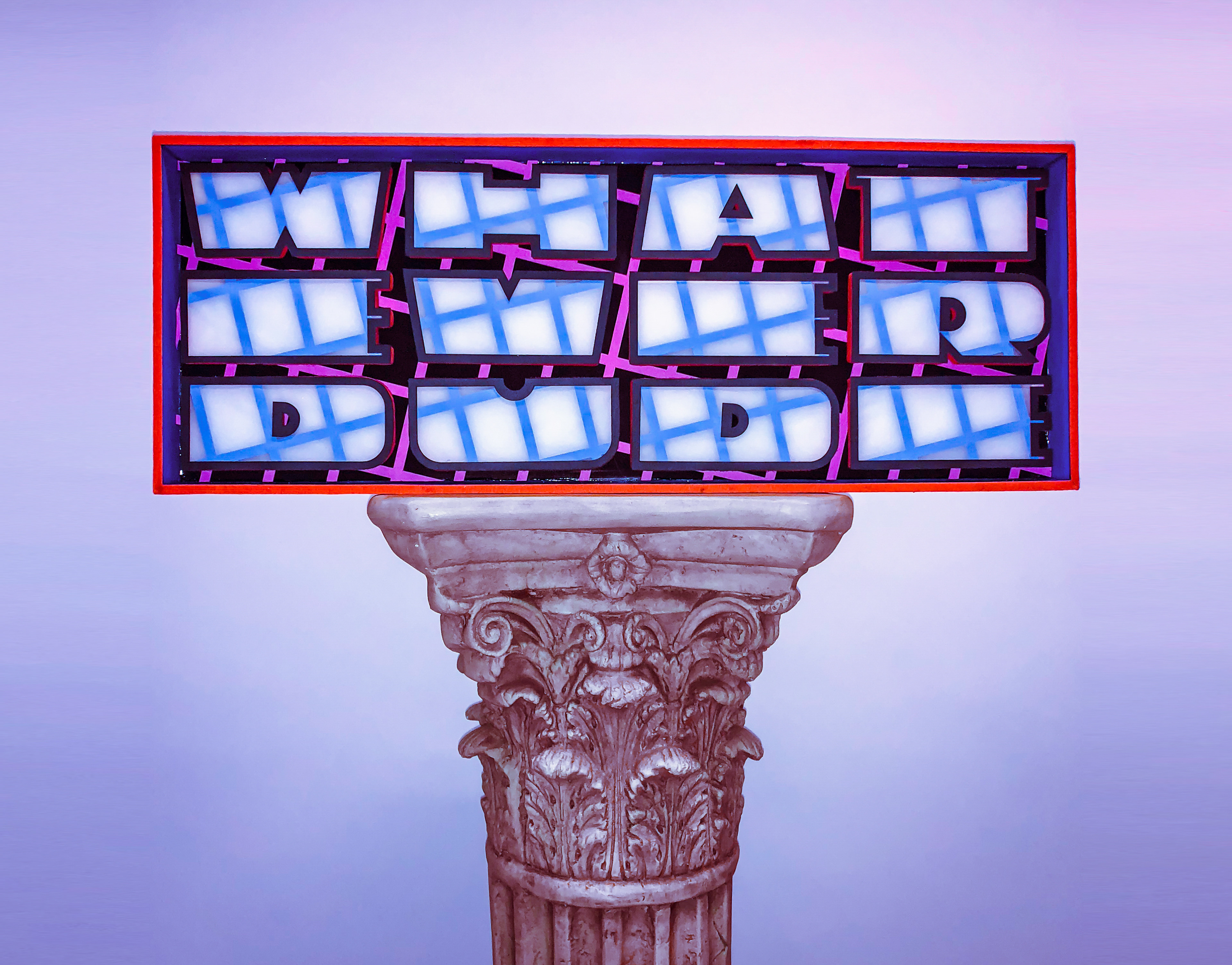
This sign was created for the sole purpose of further honing my skill in 3D signage fabrication. Without a specific application I decided to have a little fun with the design.
Design Concept
This sign is based on a color palette and design style called Outrun. Outrun is dominated by stark colors like orange, cyan, magenta, and flat black. Common design elements include odd geometry, and grids. I created the letter forms with a focus on them being shapes rather than letters and was not concerned with legibility.
Fabrication Technique
The base is covered in a very matte black sheet. A bright magenta grid is slightly lifted off that surface which causes the eye to make the background look even darker then it already is. The walls have a black outer face with a cyan inner face and trimmed with a bold orange felt. The letter forms are composed of a white base with a cyan grid which is diffused with a translucent layer. Lastly, there is a black outline on the letters. They have orange felt on the outer sides to tie it in with the base and increase visual interest when viewed from the side.