Description
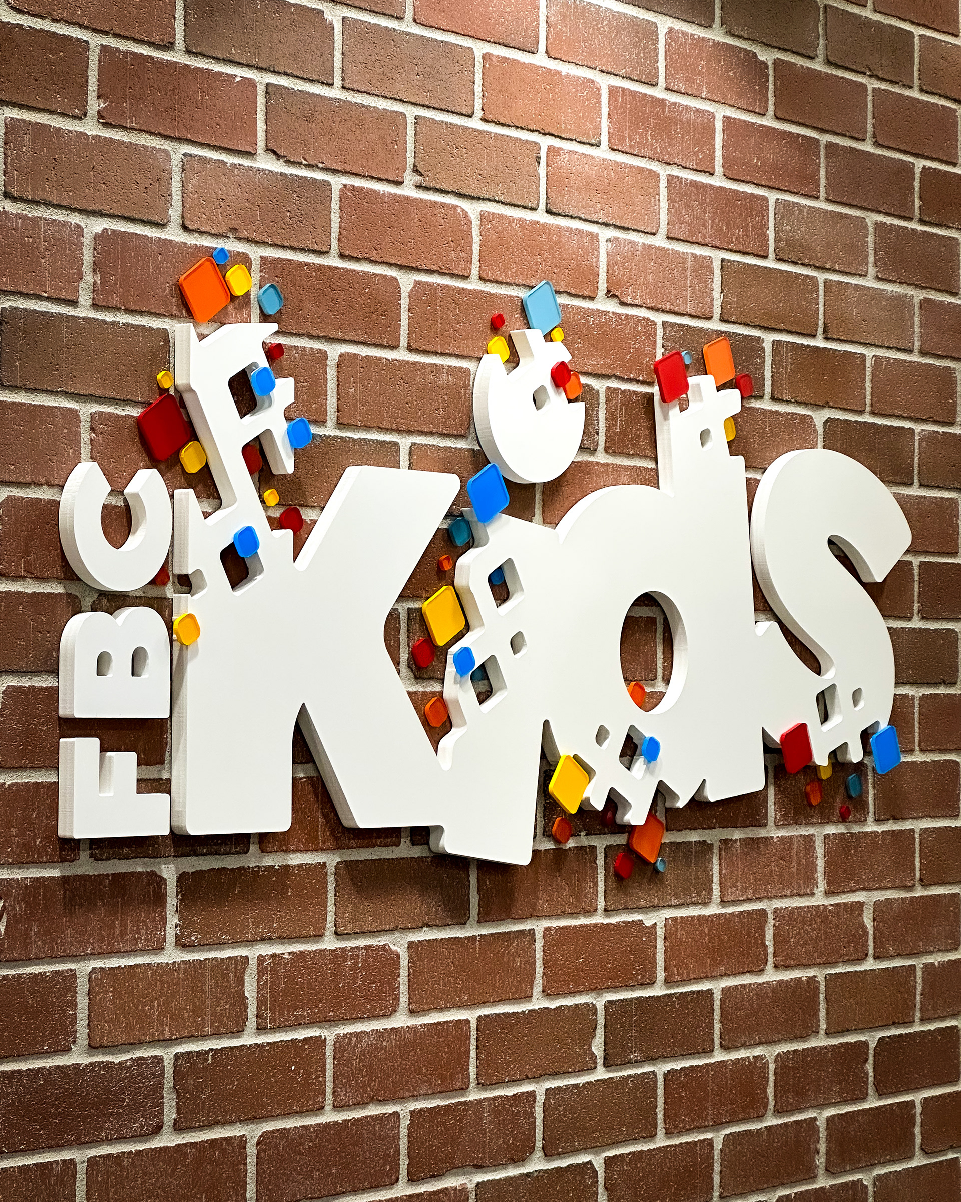
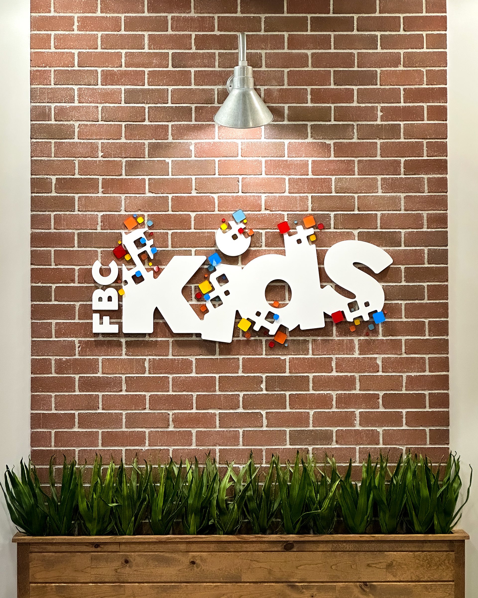
A major and full scale rebrand was initiated for this church and I was contracted to complete most of the signage updates around the facility. One of my favorite elements was this new logo for the kids department.
Design Concept
The credit for the brand refresh belongs to Stephen Houk, but I was responsible for understanding his direction and expanding upon the work he completed. This involved a comprehensive studying of the elements he created and understanding how all elements are intended to tie together throughout the facility.
Fabrication Technique
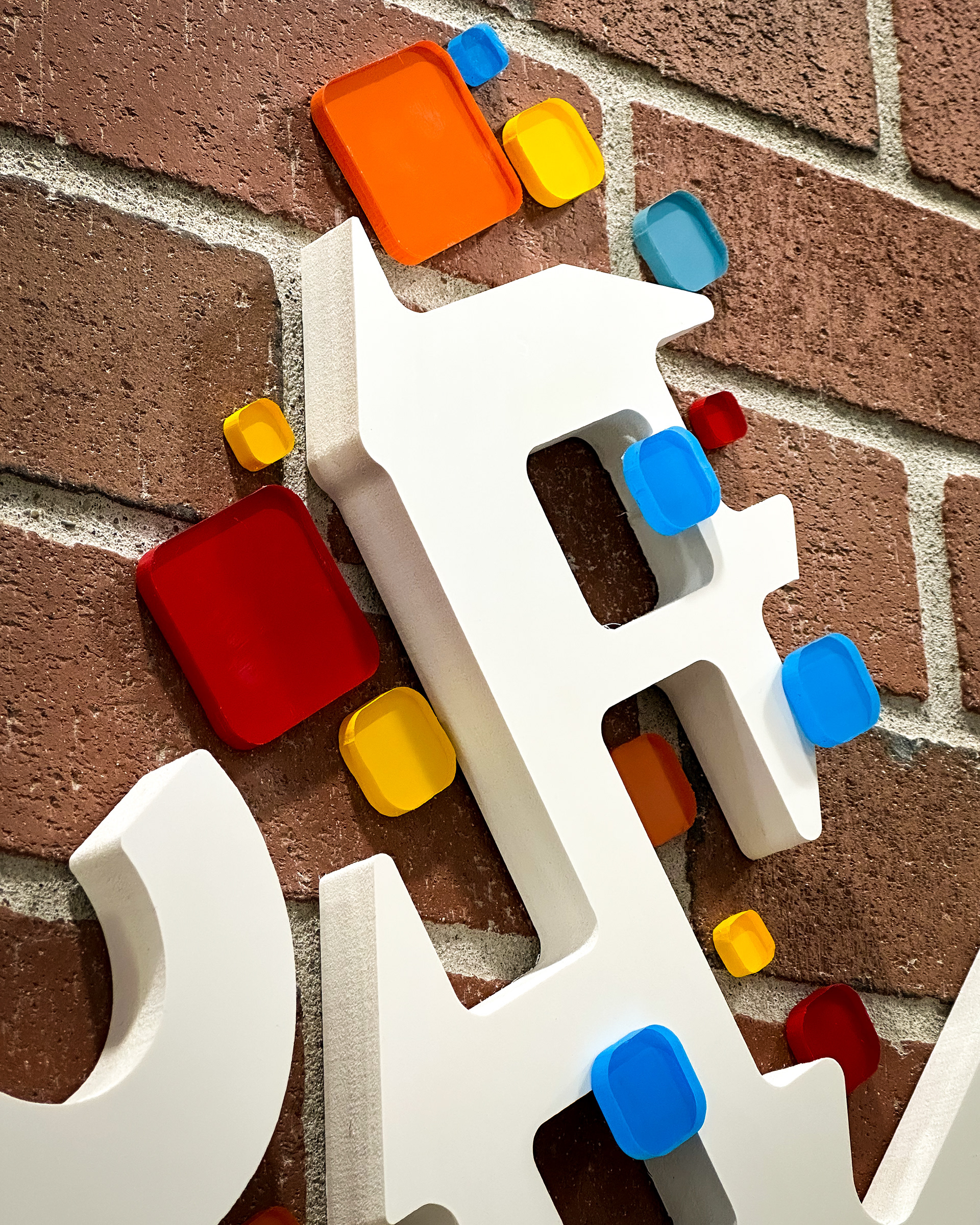
The kids logo specifically was cut from a 3/4in thick sheet of gloss white PVC. The visual interest from this dimensional logo stems from the use of "squircles" as they are called these squares are a common element throughout the rebrand and allow for a vibrancy and pop of color to modernize the brand impact of the church. The squircles were cut from 1/4in which clear acrylic and painted second surface with Montana brand spray paints. by painting the edge and painting second surface I was able to give an effect of added depth to the design.
Some of the squircles were hard to install due to their overlapping with the white base text of the logo. In order to adhere to the original design of the logo, I pocketed out little sections of the PVC layer so that there were clue platforms for the squircles but only leaving about 1/8in of the surface so the side profile of the logo was not detracted from. by having those platforms extend all the way through the material.